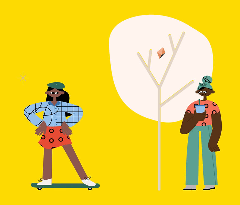
Unpack the word Stress
UX, UI & Visual Designer
MAR - SEP 2020
Stress Crusher
Normalizing stress with tangible activities for an iOS Mobile app
PROBLEM
How might we provide daily mechanisms for coping with stress & loss in a tactile or analog method?
ENVISIONING THE SOLUTION
Stress is human nature — how people think about their emotions' malleability is a crucial factor in emotional functioning. When you believe that feelings can be impacted through effort, you may be willing to try strategies to manage them better rather than them being out of your control. Reducing distress and enhancing psychological resilience are critical in promoting well-being.
CREATING FROM THE BOTTOM
An individual project actualizing research, design & testing phases of human-centered design. Inclusive of problem space & competitive research, primary interviews, ideation, information architecture, wireframes, guerrilla & usability testing, visual design, brand, interaction design — through retesting & reiteration loops. This entire project was conceptual and took place remotely.
DEFINING THE AUDIENCE
Are you feeling stress from situations, life events, or traumatic experiences? Would you prevent adverse effects on the body by recognizing and releasing negative emotional responses? Yes? Yep? Hell, Yes? Then sign up for Stress Crusher!
"Stress has a power."
THE IMPACT OF RESEARCH
IDENTIFYING THE PROBLEM SPACE
Did you know that up to 90% of illness & disease is stress-related? Up to 90%. That's a staggering statistic I want to change.
Determined & inspired within this problem space — is that we don't talk about emotions. Emotions have a high rate of the negative stigma, and displaying them means we're out-of-control. Most were never educated about feelings; shifting our attitude to handling the uncomfortable emotions means we prioritize our self-care.

DISTILLING THE
DISCOVERY
67%
Focus on Reducing Emotional Reaction & Releasing Tension
54%
Prefer to Cope by Themselves
46%
Typically Use Avoidance and/or Active Types of Coping Mechanisms
85%
Say Availability
of Coping Tools
within Their Home
is Very Important
EXPANDING THE INSIGHTS
After 7 remote video interviews, the most significant insights are tools, "need to be accessible in the moment", and "be new, easy & fun." People favor mindless activities, de-stressing while doing other things & making a tool selection based on what feels right.
During my qualitative research, I didn't expect to find that people are very interested in community-based sharing. Their go-to tools are those they stumbled upon themselves and consistently get them through stress. To my surprise, they want to help others because what works for them might work for others.
The most challenging aspect was leaving competitive research for last. I strived for my primary research to direct me through the problem space before seeing what the competition offers. Two crucial findings — first, onboarding was always time-consuming, with 30+ questions often requiring a profile to be created before any methods were suggested. Secondly, methods were still passive, typically using mindfulness & meditation with only one instance of an active tool suggestion.
Interview participants said stress releasing tools need to be accessible in the moment. This result was consistent with the survey results, which showed that its imperative tools are available within their home. Through competitive analysis, I realized that mental health apps primarily cater to passive mindfulness & meditation methods, not necessarily physical activities or creative tools.
REFRAMING THE PROBLEM
How might we instruct users through playful & immersive activities as tension releasing tools?
INTRODUCING STRESS CRUSHER
The brand strives to be a personal guide & self-care tool that compliments daily life. It is easy, doesn't squeeze too much into it & doesn't want users to be stressed using it. Stress Crusher gives users an avenue by unpacking the word 'stress,' preparing challenges based on feels, and suggesting ways to interact with their new community — all promoting well-being.


HOW I GOT HERE
KICKING OFF IDEATION
The most striking ideation was a mashup brainstorm — mental health & spectator sports. Imagine the emotions we feel when our team is winning, losing, just scored — those raw emotions are shared right then and there. We feel relief afterward. What if stress and the negative emotions that come with it can be thought of in the same way? Oh, the possibilities!!
Knowing that the users will be in a heightened state of emotion when accessing the app, I am deliberate of mindful design: a linear flow from log-in, to a short stress questionnaire, to recommended activities & closing with community engagement. I want the interaction to be stress-free by being straight-forward.
With the creation of user stories, I categorized ‘user essentials’ as the MVP — a user defining stress, getting tool recommendations, profile anonymity, receiving positive reinforcement, and community-based support. These critical tasks, known as red routes, became the focus of my study. Elements around ‘user customization’ are Priority 2 for the second release. Those features for access frequency within a given day, lifestyle preferences, identification of tools within their home, and history tracking would be rolled out in the future.
SKETCHING SCREENS
Based on data, I established 3 guiding principles for the app (shown below.) Aiming to value mental health and well-being, it’s complimentary that language is simple, tone & voice are upbeat & motivating. This reinforces the brand personality of enjoyment, learning & reward with a bit of surprise.
PRINCIPLE #1: ABBREVIATED STRESS QUESTIONNAIRE


PRINCIPLE #2: NON-CONVENTIONAL COPING TOOLS


PRINCIPLE #3: COMMUNITY-BASED SUPPORT



FIRST ROUND OF FEEDBACK
Excited to test my sketches with the public; guerrilla usability testing was my method of choice. The evaluations & observations gave me insight into the difficulties of the experience, particularly for someone following my hand sketches for the first time. This discovery piece gave me 4 critical areas for improvement.
Although the desktop website was not tested, two key screens were developed in tandem with the mobile app.
FOCUSING ON THE FLOW
Adding context to facilitate users moving forward with their critical tasks — I supplemented several screens to refine my wire flows. By boosting copywriting for a frame of reference, the user journey improved at 4 essential findings from guerrilla testing.
MOLDING THE MOOD
Most were never educated about feelings — Be Loud. Be Intentional. — the brand tagline encourages prioritization of self-care with the willful expression of your negative emotions. To actively release your stress — the app’s niche market— personalized tools are designed to pointedly address pressures. The inspiration for illustrations, color, and energy alignment will infuse these goals.
BETTING ON THE ASSETS
I was required to find iconography, illustrations, and typefaces that existed, scouting several resources to identify the just-right assets with minor color & scale editing. The Noun Project, Blush, and Dafont became the means to characterize the collateral for Stress Crusher.

The selected colors are powerful and meant to evoke a sense of momentum & intentionality behind the emotional expression. Digital accessibility in standard screen viewing mode is of importance to the brand. Selected primary colors meet AA WCAG contrast guidelines — when primary colors are used in the foreground on white or accent colored backgrounds.


LOOKIN' GOOD ON HI-FI
Although the color palette met color contrast accessibility, in my industry mentor audit, she stated the visuals in the middle of the journey didn’t feel cohesive with the landing & onboarding screens — which were well received. Favoring the high-fidelity desktop mockups, we discussed generating that same good lookin’ vibe throughout the mobile app.
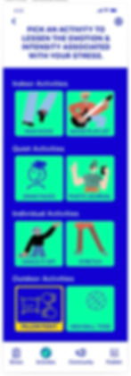
Color refinement iterations on the 'pick a challenge' mobile screen led to the far-right mobile screen as the solution.



WHAT I LEARNED FROM THESE HIGH FIDELITY MOCKUPS
-
Don’t segment a product with varying colors — use accent colors as spot colors only to create a united & imperceptible user journey.
-
Don’t use all capitals in either body heading or casing to resolve hierarchy.
-
Pay attention to language that may have cultural connotations — for example, ‘spirit animal’ was modified to read as an ‘animal superpower.’
-
Remember unusual colors, make for an unusual experience — the wrong kind.
-
Keep up the brand voice — it’s very refreshing & upbeat.
MACRO & MICRO ITERATIONS
One of my favorite details was working on selected states, visual feedback, and transitions within my InVision Studio prototype. The verbal commentary was incredible, generating a level of excitement during testing & stakeholder review.


By boosting copywriting for context,
the user journey improved 3 of 4
critical findings from guerrilla testing —
a 75% improvement.
REVELATIONS FROM USABILITY TESTING & RETESTING
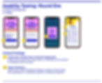
ROUND ONE REVIEW
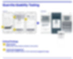
The intertwined story of meeting the community, publishing a story, and animal superpower was confusing to users. In a last-minute pivot, I turned these into 3 distinct actions that were linear yet isolated to help make the user journey understandable. A continuous indication that language — singular vs. plural tense and stress question responses should have the same sensory understanding of sound — is critical.
ROUND TWO COMMENTARY
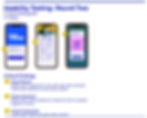
Several users questioned whether they enter the app only when stressed. I feel this is because they didn’t search for this mental health tool, as you would when you are looking for a solution to your problem. Yet, adding a link to the onboarding page to speak on the brand mission can also support this finding. The red route identified a scenario of someone in ‘moderate’ stress. However, if ‘mild’ was selected — there would be a different set of responses to the stress questions to better align with that degree of stress. Lastly, one person found that the animal superpower felt random — although this is an improvement from round one — there is an option to pull this element forward in the design journey, just after completing the challenge, joining the association of pick a challenge & the animal superpower. This is an area for future iteration & testing.
WHAT I LEARNED FROM USABILITY TESTING & RE-TESTING
-
Be Direct — user flow should follow the written explanation.
-
UX Writing — provides uniformity in language when speaking to the user with instructions vs. the user’s voice. Including consistency of singular & plural noun tense and the sensory association of wording in responses is crucial.
-
Niche Market — introduce the brand mission along during onboarding for those that found Stress Crusher by word of mouth.
-
Red Route — although testing critical tasks, it is necessary to understand other user responses to grasp how the product features shift to accommodate.

"Why does something I can't control, control me so much?"



"I need your app."
PROJECT OUTCOME & RECAP
This capstone is a great start in providing a niche market solution — deliberately using energy to release stress — and crushing it. The brand derived from this — Stress Crusher — treats mental health distress with the same intentionality as experiencing spectator sports.
To refine & define the new Stress Crusher ™ app, I relied on 31 screener survey responses, 7 interviews, 9 competitive market studies, and 15 usability tests over research & design. It started with a deeper understanding of the qualitative information received from the screener surveys, yet allowing the conversations & testing to validate or reiterate the user experience.
Although usability tests revealed that users could get through the red routes, they struggled with the animal superpower idea. Discussions with users revealed they value privacy. This feature allows them to not only embody their achievement in releasing stress but adding a layer of discretionary confidentiality to participate in a connected community under their animal superpower, instead of using their name.
The simplicity of the stress questionnaire is a direct impact of competitive research from inception. Minimizing friction — the user responds to 3 stress questions optimized with simple responses for a personalized self-care experience tailored to the day’s stress.
Stress Crusher ™ is approachable, personalized, creative, and human, with an animal superpower element of surprise. I have dreams of making this a viable app, but in the interim, check out my prototype: Stress Crusher
If I did launch this product I would be looking at conversion rates to understand user engagement — how many people download the app, site visitation & frequency, community interaction, and requests to have the app touch base with users the following day. These metrics would influence further iterations & testing.
"I would download this now."
AS A UX, UI & VISUAL DESIGNER, I EXPERIENCED...
-
The value usability testing provides for real-world understanding
-
How imperative language is to context & for word association
-
That visual design is a driver for infusing goals
-
The user journey is critical for the ease & flow of moving through a design
-
That trusting the unknown explored through the design thinking process is energizing
-
How essential hand sketching & prototyping is to creating & combining all the above